
Guide
Choosing stitches for monograms
Plan a readable needlepoint monogram with balanced strokes, open counters, and a quiet background. Includes a practical initial-and-border example.
A monogram should be the first thing the viewer reads. Its background can be decorative, but the initials need clear edges and enough unoccupied space around them. Decide the letters’ final shapes before selecting the surrounding stitch.
Begin with the narrowest stroke and the smallest opening inside a letter. Those features limit the usable thread and stitch size. A bold outer curve does not solve an A whose center has filled in.
Build the initial as one coherent shape
Compact tent stitching is a reliable way to preserve the planned positions. Use continental tent stitch where the letters form short lines or isolated sections. A large block initial may have room for decorative filling, but thin connecting strokes still need a treatment that fits.
Imagine an M centered in a square ornament. First mark the outer left and right edges, the central valley, and the two inner diagonal strokes. Keep those landmarks symmetrical if the design calls for symmetry. Fill the broad uprights only after you know the central opening remains clear.
Now decide whether the initial should stand apart through color, texture, or both. A dark smooth M on a lighter textured field can work without metallic thread or a heavy outline. If the letter already has strong shine, a flatter background may provide enough separation.
| Problem in the plan | Change to consider | Avoid |
|---|---|---|
| Initial blends into the field | Increase value contrast or quiet the background | Adding more unrelated textures |
| Small center opening disappears | Widen the opening on the counted plan | Forcing a larger needle through the same crowded holes |
| Thin flourish breaks apart | Simplify or enlarge that flourish | Using long unsupported spans to join it |
| Border touches the initial | Restore a deliberate gap | Letting the background repeat dictate the letter shape |
Make the surrounding pattern serve the letters
A mosaic background can add a small regular texture, but its pattern needs to continue around the monogram. Plan where the repeat sits before filling separate spaces between the strokes. Restarting independently in each opening can produce several mismatched grids.
Keep the contrast of the background pattern below that of the initials. Two alternating background colors may look attractive on their own yet turn the monogram into the least noticeable part of the piece. Use quiet background selection to reduce that competition.
On 13 mesh, narrow flourishes occupy more physical space per counted position. At the same finished size, 18 mesh offers more room to shape a curve, but fine detail still needs a readable silhouette. For very small initials, the principles in tiny lettering matter more than decorative filling.
Check the monogram at display distance with the border included. The letter, its surrounding gap, and the border should each remain identifiable. If the first impression is a patterned square rather than an initial, simplify the field before adding anything more to the letter.
Keep learning
Guide
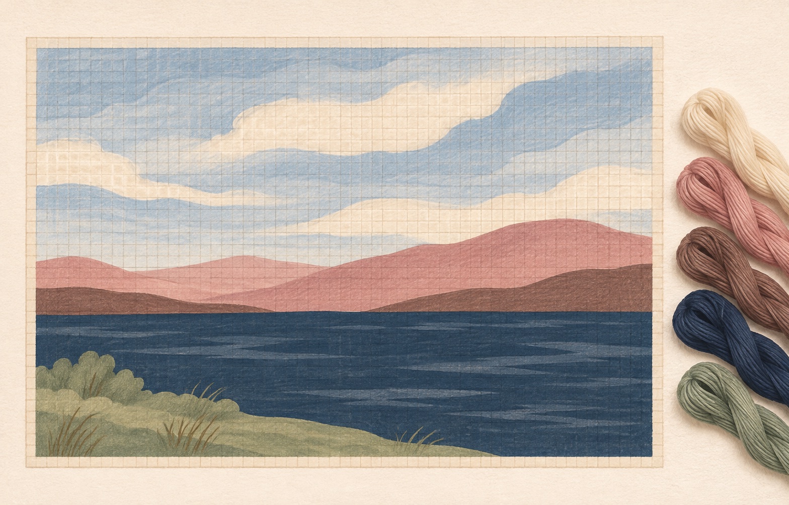
Choosing stitches for water
Choose between tent stitch, mosaic, and horizontal straight stitches for water, with a worked pond and shoreline example.
Guide
Choosing stitches for skies
Compare quiet tent stitch, mosaic, and an open sky treatment, then plan a roofline and cloud without breaking the design.
Learning path
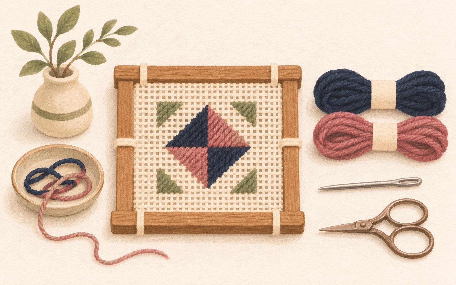
Your first needlepoint canvas: a learning path
Follow a linked beginner path from choosing a canvas and planning its finish to starting threads, stitching, and checking your first project.